
👭 Building 2 Nextjs websites at the price of 1, by hacking the light/dark mode
Recently the Gato GraphQL team has launched Gato Plugins, a sibiling site to Gato GraphQL.
You will notice that they are both the same site! The only difference between the two is the color scheme: Gato GraphQL is dark-themed, while Gato Plugins is light-themed.
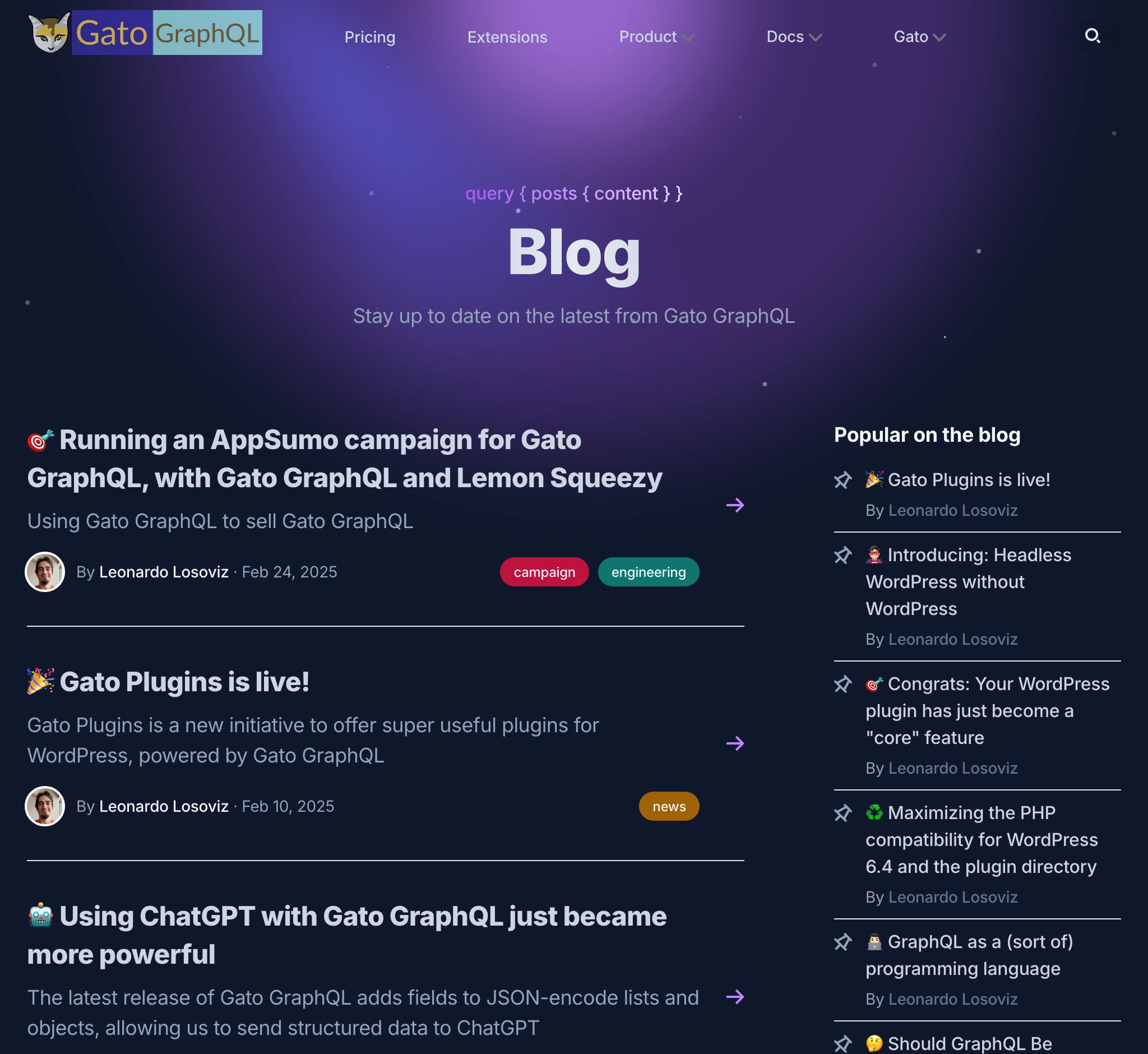
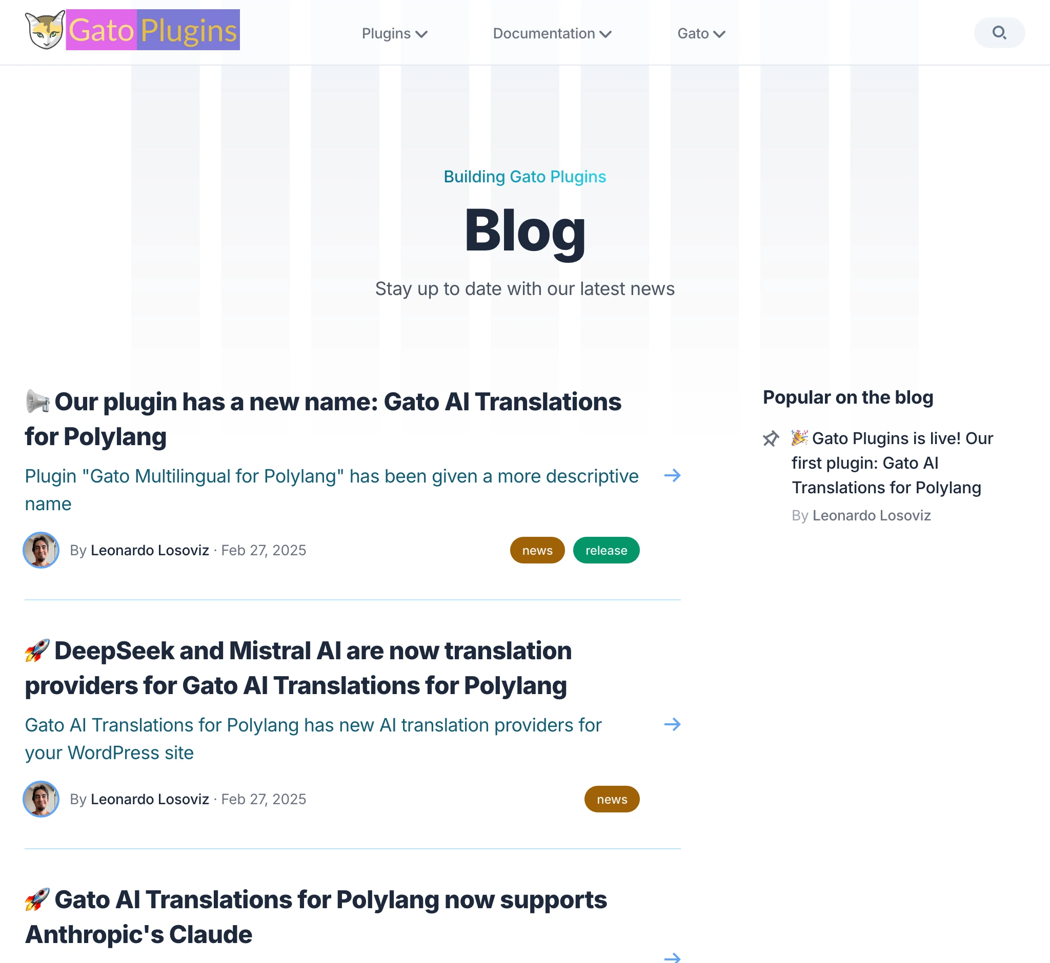
The blog section on both sites is exactly the same:
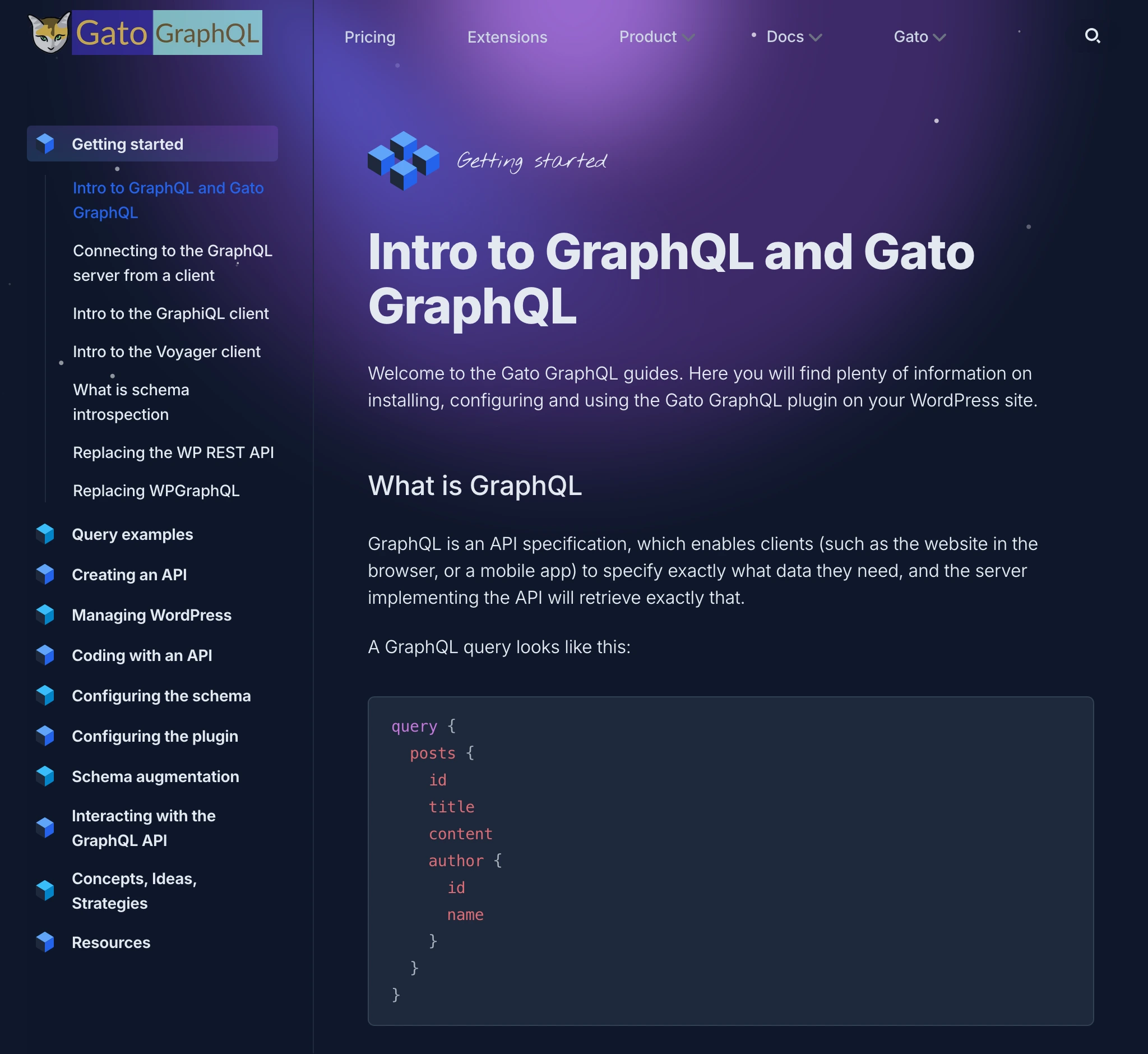
The docs section is also the same:
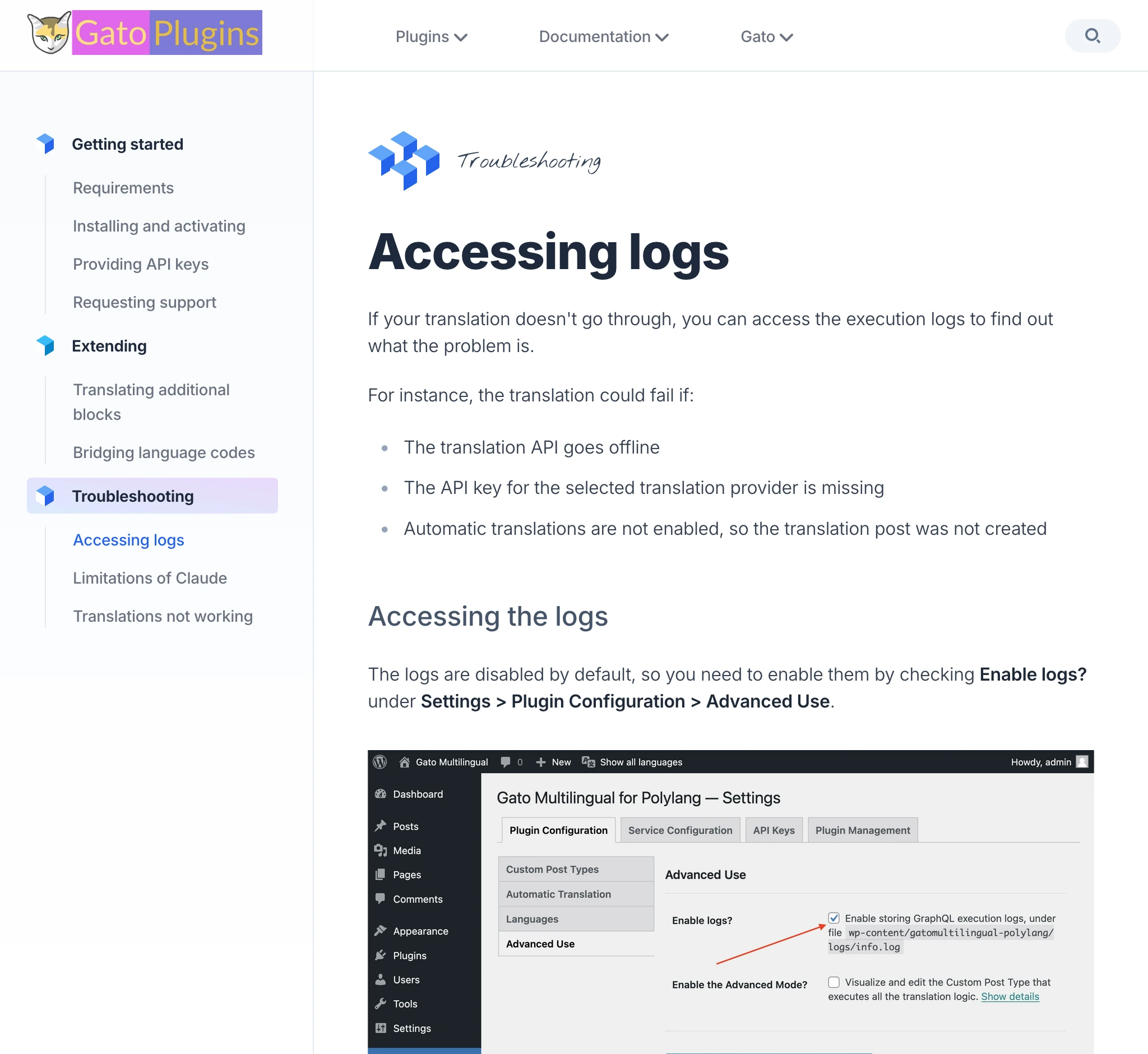
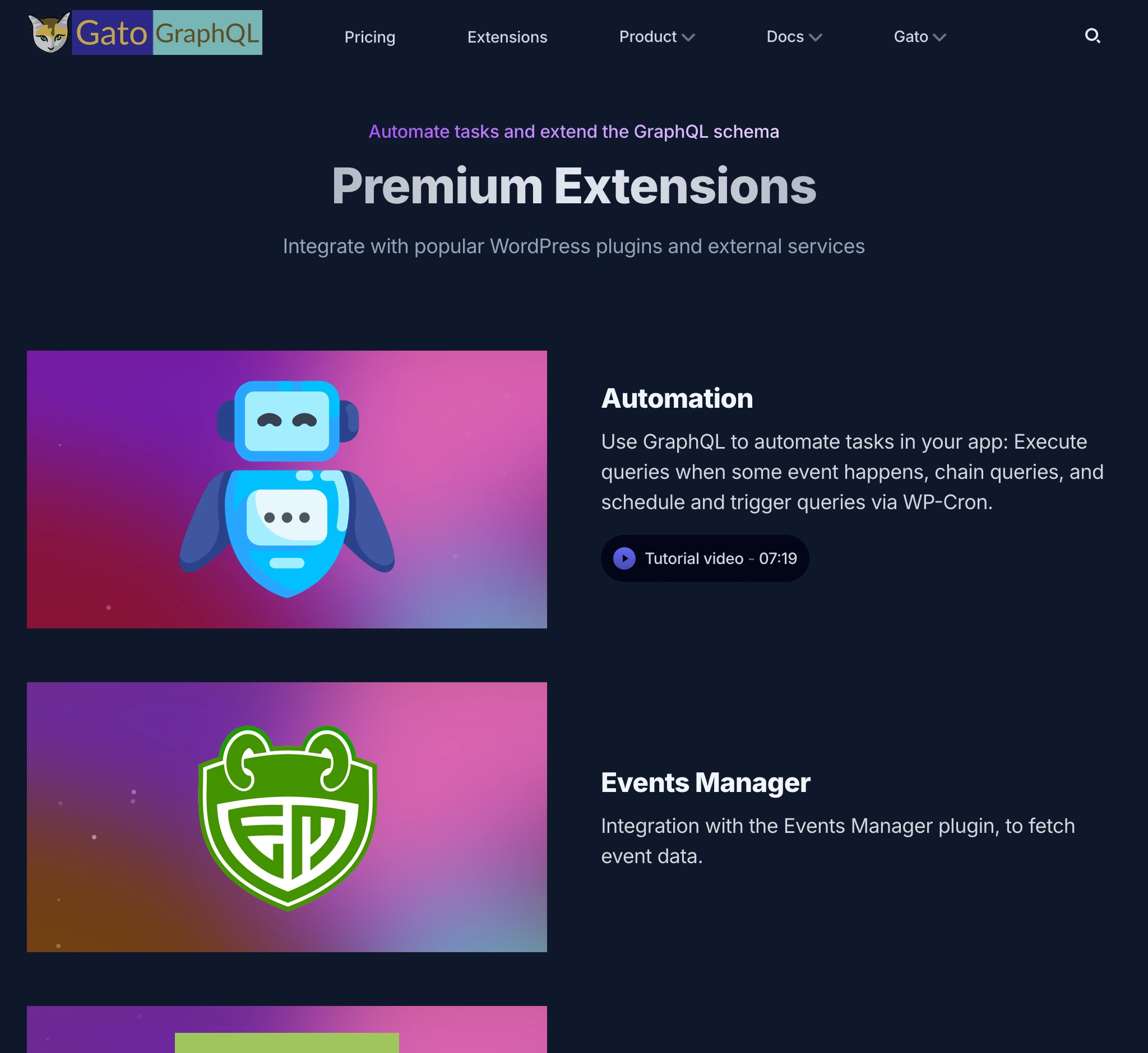
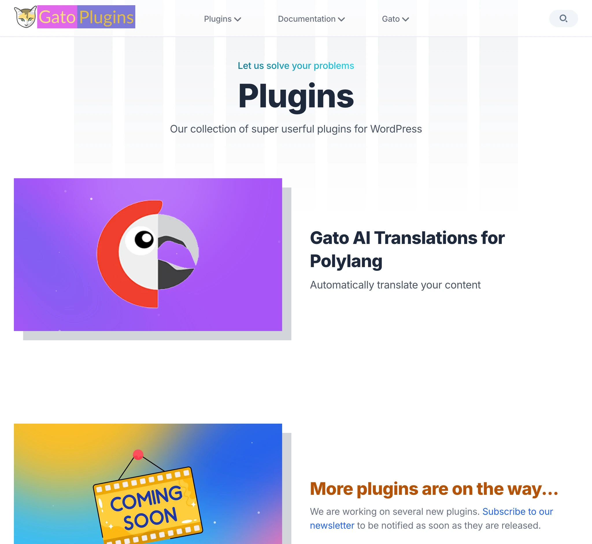
Sometimes the section is different, however the underlaying foundation is the same.
For instance, Gato GraphQL extensions and Gato Plugins plugins use the same layout:
(Btw, also the logos are pretty much the same! 😜)
And yes, this blog post is also on both sites! 😂
Read on gatographql.com: Building 2 Nextjs websites at the price of 1, by hacking the dark/light mode.
However, there are exactly 7 differences between the posts on the two sites. Can you spot them all? If you do, I'll give you a coupon with a discount for Gato GraphQL 🙏
Why we used the light/dark modes to produce 2 websites
There are multiple reasons:
I don't have the time or energy to maintain two separate codebases. I need to keep things simple.
Every hour I spend on the website is an hour I don't spend on either of my products.
I want them to look similar, so that users can recognize them as part of the same family.
I'm not a designer. Having achieved that look and style, I was satisfied, and I didn't want to start from scratch.
In other words: because it's cheap and easy. It saved me tons of time and energy, that I could employ in my own product.
As a disadvantage, the 2 sites cannot support the dark/light mode toggle, so their style is fixed, but that's something I can live with.
Alright then! So let's get our hands dirty, and see how it was done.
Stack: The application is based on Next.js, and Tailwind CSS for styling.
It was created as a combination of several templates by Cruip, customized to our needs. (Those templates are beautiful!)
Content is managed via Contentlayer.
Extract the common code into a shared package, and host everything in a monorepo
Since the codebase for both websites is the same, it only makes sense to host them all together in a monorepo.
My repo originally had a single project:
- gatographql.com
It was restructured into the following:
- apps/gatographql.com: Gato GraphQL website
- apps/gatoplugins.com: Gato Plugins website
- packages/shared/gatoapp: Shared code across both websites
This is my workspace in VSCode:
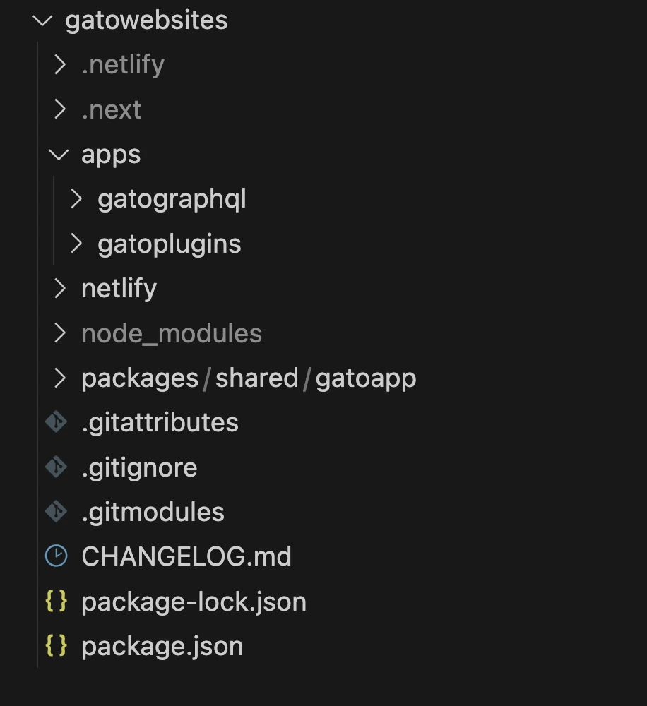
I don't use anything fancy for a monorepo, a simple workspaces does the job well.
My package.json at the root of the monorepo now looks like this:
{
"name": "gatowebsites",
"version": "2.0.0",
"private": true,
"workspaces": [
"apps/*",
"packages/shared/*"
]
}In addition, I added scripts to package.json to run/build/deploy both projects (including to deploy to Netlify, where both of them are hosted):
{
"scripts": {
"dev-gatographql": "npm run dev --workspace=apps/gatographql",
"build-gatographql": "npm run build --workspace=apps/gatographql",
"deploy-gatographql": "npm run deploy-staging-gatographql",
"deploy-dev-gatographql": "netlify dev --filter gatographql",
"deploy-staging-gatographql": "netlify deploy --build --context deploy-preview --filter gatographql",
"deploy-prod-gatographql": "netlify deploy --build --prod --context production --filter gatographql",
"dev-gatoplugins": "npm run dev --workspace=apps/gatoplugins",
"build-gatoplugins": "npm run build --workspace=apps/gatoplugins",
"deploy-gatoplugins": "npm run deploy-staging-gatoplugins",
"deploy-dev-gatoplugins": "netlify dev --filter gatoplugins",
"deploy-staging-gatoplugins": "netlify deploy --build --context deploy-preview --filter gatoplugins",
"deploy-prod-gatoplugins": "netlify deploy --build --prod --context production --filter gatoplugins"
}
}Convert components to receive props for custom data
As much as possible, we move code from each of the websites into the shared package, and then we customize the behavior via props.
For instance, the shared package gatoapp contains a BlogSection component (to print the /blog page on both sites):
import PopularPosts from 'gatoapp/components/blog/popular-posts'
import PageHeader from 'gatoapp/components/page-header'
import { BlogPostProps } from 'gatoapp/types/list-types'
import BlogSectionPostList from './blog-section-post-list'
import { useEffect, useState, Suspense } from "react";
export default function BlogSection({
blogPosts,
title = "Our Blog",
description,
campaignBanner,
}: {
blogPosts: BlogPostProps[],
title?: string,
description: string,
campaignBanner?: React.ReactNode
}) {
const sidebar = (
<aside className="hidden sm:block relative mt-12 md:mt-0 md:w-64 md:ml-12 lg:ml-20 md:shrink-0">
<PopularPosts
blogPosts={blogPosts}
/>
</aside>
)
return (
<div className="max-w-6xl mx-auto px-4 sm:px-6">
<div className="pt-32 pb-12 md:pt-40 md:pb-20">
{campaignBanner}
{/* Page header */}
<PageHeader
title={title}
description={description}
/>
{/* Main content */}
<BlogSectionPostList
blogPosts={blogPosts}
sidebar={sidebar}
/>
</div>
</div>
)
}All content is the same, except for:
- The page header (title/description)
- The blog posts
- The campaign banner
Since the two websites can run their own campaigns independently from each other, passing campaignBanner as a React.ReactNode does not constrain customizing the campaigns.
For instance, as I publish this blog post, I'm running a campaign in Gato GraphQL, but not in Gato Plugins:

To inject the blog posts, it takes a bit of more logic.
Injecting blog posts
The data for the blog posts is injected to BlogSection via the blogPosts prop.
Since I'm using Contentlayer, each website will have a contentlayer.config.js file at the root, defining the types on the site.
This configuration file cannot be moved to the shared gatoapp. Then, we create an export module to provide the configuration for the shared types, and then import these in the contentlayer.config.js for each site, making the logic DRY.
gatoapp has export module contentlayer.config.js providing the shared type BlogPost:
import { defineDocumentType } from 'contentlayer2/source-files'
const BlogPost = defineDocumentType(() => ({
name: 'BlogPost',
filePathPattern: `blog/**/*.mdx`,
contentType: 'mdx',
fields: {
title: {
type: 'string',
required: true
},
publishedAt: {
type: 'date',
required: true
},
description: {
type: 'string',
required: true,
},
image: {
type: 'string',
},
},
computedFields: {
slug: {
type: 'string',
resolve: (doc) => doc._raw.flattenedPath.replace(new RegExp('^blog/?'), ''),
},
urlPath: {
type: 'string',
resolve: (doc) => `/blog/${doc._raw.flattenedPath.replace(new RegExp('^blog/?'), '')}`,
},
},
}))
module.exports = {
types: {
BlogPost: BlogPost,
},
}File contentlayer.config.js in both apps/gatographql.com and apps/gatoplugins.com can then import that type:
import { makeSource } from 'contentlayer2/source-files'
import ContentLayerConfig from '../../packages/shared/gatoapp/contentlayer.config.js'
const BlogPost = ContentLayerConfig.types.BlogPost
export default makeSource({
documentTypes: [BlogPost],
})Normally, to reference type BlogPost in our code, we'd import it like this:
import { BlogPost } from '@/.contentlayer/generated'However, type BlogPost lives under the website, not under the shared package, so the shared code cannot directly reference that type.
We solve this with a hack: We copy the definition for that type from the compiled Contentlayer file (under apps/gatographql/.contentlayer/generated/types.d.ts), and paste it into a new types.tsx file in the shared package:
import type { MDX, IsoDateTimeString } from 'contentlayer2/core'
export type BlogPost = {
// _id: string // not needed
// _raw: Local.RawDocumentData // not needed
type: 'BlogPost'
title: string
publishedAt: IsoDateTimeString
description: string
image?: string | undefined
body: MDX
slug: string,
urlPath: string,
}Then we reference this shared type in the shared code:
import { BlogPost } from 'gatoapp/types'Since the properties between the BlogPost types in the website and shared package are the same, we can pass the former to a component that expects the latter.
Create a context to inject global props
Navigation menu components will be printed on the shared code, but they need to be provided via the website code, as each website will have its own menus.
The menus appear in all pages, and we don't want to have to pass them via props time and again. So we use a React context, allowing us to inject the navigation menu components only once.
We create a context called AppComponent in the shared package:
'use client'
import React from 'react'
import { createContext, useContext } from 'react'
import { StaticImageData } from 'next/image'
type ContextProps = {
header: {
menu: React.ReactNode,
mobileMenu: React.ReactNode,
},
}
const AppComponentContext = createContext<ContextProps>({
header: {
menu: <div></div>,
mobileMenu: <div></div>,
},
})
export interface AppComponentProviderInterface extends ContextProps {
children: React.ReactNode,
}
export default function AppComponentProvider({
children,
header,
}: AppComponentProviderInterface) {
return (
<AppComponentContext.Provider value={{ header }}>
{children}
</AppComponentContext.Provider>
)
}
export const useAppComponentProvider = () => useContext(AppComponentContext)We reference it in our shared package:
'use client'
import Logo from './logo'
import HeaderMobile from './header-mobile'
import { useAppComponentProvider } from 'gatoapp/app/appcomponent-provider'
export default function Header() {
const AppComponent = useAppComponentProvider()
return (
<header className="fixed w-full z-50">
<div className={`absolute inset-0 bg-opacity-70 backdrop-blur -z-10 bg-white border-slate-200 border-b dark:border-b-0 dark:bg-transparent dark:border-slate-800`} aria-hidden="true"/>
<div className="max-w-6xl mx-auto px-4 sm:px-6">
<div className="flex items-center justify-between h-16">
{/* Site branding */}
<div className="flex-1">
<Logo />
</div>
<nav className="hidden md:flex md:grow">
{/* Desktop menu links */}
{AppComponent.header.menu}
</nav>
<HeaderMobile />
</div>
</div>
</header>
)
}And we inject it via the website code, in apps/gatographql/app/(default)/layout.tsx:
import AppComponentProvider from 'gatoapp/app/appcomponent-provider'
import HeaderMenu from '@/components/menu/header-menu'
import HeaderMobileMenu from '@/components/menu/header-mobile-menu'
import DefaultLayout from 'gatoapp/app/(default)/layout'
export default function AppDefaultLayout({
children,
}: {
children: React.ReactNode
}) {
return (
<AppComponentProvider
header={{
menu: <HeaderMenu />,
mobileMenu: <HeaderMobileMenu />,
}}
>
<DefaultLayout>
{children}
</DefaultLayout>
</AppComponentProvider>
)
}Finally, the website implements its own HeaderMenu component:
import Link from 'next/link'
import Dropdown from 'gatoapp/components/utils/dropdown'
export default function HeaderMenu() {
return (
<ul className="flex grow justify-center flex-wrap items-center">
<li>
<Link href="/pricing">Pricing</Link>
</li>
<li>
<Link href='/extensions'>Extensions</Link>
</li>
<Dropdown title="Product">
<li>
<Link href='/features'>Features</Link>
</li>
<li>
<Link href='/highlights'>Highlights</Link>
</li>
<li>
<Link href='/demos'>Demos</Link>
</li>
<li>
<Link href='/comparisons'>Comparisons</Link>
</li>
<li>
<Link href='/roadmap'>Roadmap</Link>
</li>
</Dropdown>
</ul>
)
}Styles for light and dark modes
In Tailwind, we prepend a class with dark: to use it when dark mode is enabled.
Then, our shared package code must contain the styles for both light and dark variants.
For instance, component PageHeader prints the description with different colors for light mode (text-gray-600) and dark mode (dark:text-slate-400):
export default function PageHeader({
title,
description,
children,
}: {
title: string,
description?: string,
children?: React.ReactNode,
}) {
return (
<div className="max-w-3xl mx-auto text-center">
<h1 className="h1 pb-4">{title}</h1>
{description && (
<div className="max-w-3xl mx-auto">
<p className="text-gray-600 dark:text-slate-400">{description}</p>
</div>
)}
{children}
</div>
)
}Set the light or dark mode on the site
gatographql.com uses the dark mode. It defines it by adding classname dark to <body> in file apps/gatographql/app/layout.tsx (plus classnames for styling: bg-slate-900 text-slate-100):
import { Inter } from 'next/font/google'
import RootLayoutHeader from 'gatoapp/app/layout-header'
const inter = Inter({
subsets: ['latin'],
variable: '--font-inter',
display: 'swap'
})
export default function RootLayout({
children,
}: {
children: React.ReactNode
}) {
return (
<html lang="en">
<RootLayoutHeader />
<body className={`${inter.variable} dark bg-slate-900 text-slate-100`}>
{children}
</body>
</html>
)
}gatoplugins.com uses the light mode. This is the default mode, so there's no need to add any particular classname to <body> (only those for styling: bg-white text-slate-700):
import { Inter } from 'next/font/google'
import RootLayoutHeader from 'gatoapp/app/layout-header'
const inter = Inter({
subsets: ['latin'],
variable: '--font-inter',
display: 'swap'
})
export default function RootLayout({
children,
}: {
children: React.ReactNode
}) {
return (
<html lang="en">
<RootLayoutHeader />
<body className={`${inter.variable} bg-white text-slate-700`}>
{children}
</body>
</html>
)
}That's it
I have now 2 websites, that I got for the price of 1. And I'm very happy with that.
Now, go find the 7 differences, and get your prize! 😅
